
Hello everyone and welcome in for another article. In this article I’m going to break down a bunch of advanced stats that I take into consideration when projecting player performance before and during each season. I want to take a second to invite you to join the Apples & Ginos Discord server where I would be more than happy to answer any questions you have about advanced stats, my process, or why I continue to choose to cause myself pain via cheering for the Leafs.
First I want to give a shout out to Natural Stat Trick (NST). They provide all the advanced stats you could want absolutely free with easy to use filters and a CSV exporting function to boot. They are truly the GOAT in the NHL advanced stat space in my humble opinion. I use their stats almost exclusively in all of my articles as I haven’t really found the need to go elsewhere.
Starting Out
Before diving in, I’d like to address a buzzword that is always used when analytics and advanced stats start getting thrown around. “Regression” is now commonly used to simply mean that a certain stat or player is unlikely to continue at the current pace, and will therefore “regress” to a more sustainable rate in the future. This can be used in both a positive or negative context. A negative regression is when a player or stat is performing at too high a level and is likely to come back down to a lower rate. A positive regression as you have probably guessed is when a player or stat is performing at too low a level and is likely to come back up to a higher rate. This is most commonly used in hockey circles in reference to statistics like individual points percentage (IPP), shooting percentage (S%), on-ice shooting percentage (oiSH%), and the sum of on-ice shooting percentage and on-ice save percentage (PDO). These statistics have shown a tendency to regress both positively and negatively to a mean (average) level. That mean is different depending on the player, team, or situation being studied, but don’t worry! There are certainly ways to determine what that mean should be and thereby determine if a player is likely to regress or performing as expected.
When starting my analysis I always use rate stats rather than raw counts. Some people like using per game numbers, but in my opinion the per 60 minutes of ice time rate stats that NST provides levels the playing field and allows you to compare players getting 14 minutes of ice time per game directly to players receiving 20 minutes of ice time per game. For instance, a player who shoots twice in 13:20 of ice time is shooting at the same rate as a player who shoots three times in 20:00 of ice time; they’re both shooting at a rate of 6 times per 60 minutes. Using rate stats allows that direct comparison which allows us to make a quick and easy projection to say, hey if Ryan Donato ever got 18 minutes a game he’d have 210 shots in an 82 game season. From there it’s an easy enough calculation to say that if Donato continued to convert shots into goals at his career 10.5% shooting percentage, he’d score 22 goals and that might be worth something to a fantasy manager.
Of course, there are many more layers than just shots and shooting percentage. This is supposed to be an advanced stats article after all. I’m going to start with individual advanced stats, and I think you should too. On-ice advanced stats are important, but there will always be four other players on the same team influencing those stats and therefore there are more confounding variables to potentially cloud our analysis. I’ll be going from left to right based on NST’s “Individual” stats page so you’ll be able to track along if you’re looking at a player on their site.
Secondary Assists
The first stat I want to cover is secondary assists. This is pretty straightforward – a first or primary assist is awarded to the player who last touched the puck before the goal scorer, and the second or secondary assist is awarded to the player who touched the puck before him. Secondary assists are generally viewed as a bit of a luck stat, which intuitively makes sense: the second-last guy to touch the puck before the goal scorer most likely didn’t affect the play as much as the last guy to touch the puck before the goal scorer. I ran a quick study on secondary assists in 2019/20 and how those players performed in 2020/21 and the results were not terribly definitive, but informative nonetheless:
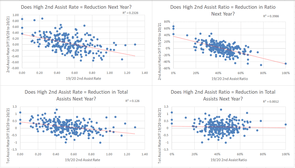
What I can say is that:
- There is a general trend leaguewide where a high secondary assist rate (on a per 60 minute basis) regresses to a lower secondary assist rate the following season. However, there is a ton of variance in secondary assist rates from season to season and trying to bet on any one player regressing is not a solid bet to make. R-squared here was 23% so not super predictive.
- There is also a general trend leaguewide where a high secondary assist RATIO (think of this as the % of total assists that are secondary assists) regresses the following season. The trend is not steep but the variance is much tighter; this means there’s a good chance that the secondary assist ratio will regress closer to the mean the following season, but also that secondary assist ratios tend to repeat reasonably closely year over year. So if your player consistently rocks a higher than average secondary assist ratio, you don’t need to freak out about it. R-squared here is much better at 40%, a point at which I’d say there is definite correlation. One other thing to note: This does not tell us whether the player simply loses secondary assists to balance the ratio or if secondary assists get converted into primary assists. But don’t worry, we’re getting there!
- There is a slight trend for players with high secondary assist rates to post reduced total assist rates the following season, but it’s not pronounced enough for me to definitively say you should fade players with high 2nd assist rates. That’s not to mention that the variance is huge on this chart, meaning that applying a slight negative value to a player projection is almost certainly going to be wildly wrong in one direction or another anyways. The R-squared is miniscule here as well at 12.6% – my conclusion is that trying to use a high secondary assist rate to predict an impending reduction in total assist rate is a fool’s errand.
- Secondary assist ratio means nada for total assist rate the following season. But if a player gets too many secondary assists vs primary assists, that means he’s bad and his total assist rate will decline next year, right? Nope. There is the slightest of negative trendlines but anyone who looks at that blob will see that these are two data sets that don’t correlate in any direction. R-squared is essentially zero. Combining this with what I found in point #2, I conclude that a player is more likely to convert some secondary assists into primary assists than to lose the assists outright.
I would like to put a caveat on these findings considering that this is one year’s worth of data from two shortened seasons. Best practice would be to repeat the study with five years’ worth of data at least, but I do doubt that the findings would be significantly different given that I’m already dealing with literally thousands of assists as data points. One takeaway I do have is that I will not be fading players based on secondary assist rates alone – it will be inconsequential to me when building my projections for next season.
Individual Points Percentage (IPP)
Next up is IPP. IPP stands for individual points percentage, which is the percentage of goals scored while that player was on the ice that the player got a point on. So when Connor McDavid scored 97 points last year and was on the ice for 123 goals scored by his team, his IPP was 97 divided by 123, or 78.9%. IPP is often used in both positive and negative directions as an indication of whether a player is running too hot and will likely cool down some, or inversely as an indication of whether a player is running too cold and will likely improve their point production moving forward. Generally the best way to do this is to look at a player’s IPP relative to their last couple of seasons or career average. I haven’t done a complete study on IPP yet, and as a result I don’t have a hard and fast standard for how many percentage points more or less than that average raises my eyebrows. As a general rule based on anecdotal evidence of personally reviewing hundreds of individual players’ IPP trends I would say 8% or more higher than their last couple of seasons is a pretty solid indication that they were getting a little too lucky factoring in on goals scored while they were on the ice, and by the same token 8% or more less than their last couple of seasons is a good indication that they were getting a little too unlucky factoring in on goals scored. IPP can also vary high and stay there if a certain player is clearly more skilled than the rest of his linemates and has to “carry” his line. Nikolaj Ehlers in 2019/20 was a prime example of this with a 90% IPP on the season skating on Winnipeg’s second line and second power play unit. If you had predicted a huge dropoff for him based on that IPP you would have missed out on his stellar play this season.
A couple of stats for you to set some sort of baseline when it comes to IPP: in 2021 the mean IPP among NHL forwards who played at least 40 games was 64.0%, and among defensemen it was 35.5%. Now obviously this statistic is skewed downwards a bit by simple virtue of the fact that there are fewer good players with high IPPs than the more recyclable lower tier players with low IPPs, but at the very least this statistic gives you a starting point.
Shooting Percentage (S%)
Shooting percentage (S%) isn’t an advanced stat, but it is a statistic that tends to regress to a mean over the course of a player’s career. Every year there are shooting percentage outliers in both positive and negative directions (Mika Zibanejad shot 19.7% percent in 2019/20 after shooting 12.7% in both of the previous two seasons, while Alex DeBrincat shot just 8.7% in 2019/20 after shooting 15.5% and 18.6% in his first two seasons). Those are very strong indications of impending regression, unless there is an accompanying increase in shot quality that explains the increased S%. When someone jumps 7% like Zibanejad, it’s almost impossible for that variance to be explained by improved shot quality. Again I haven’t done a formal study here but as a general rule anything above 4% variance is an indicator of potential regression for me unless there are strong circumstantial factors. Those who loved Zibanejad despite the obvious shooting luck pointed to the addition of Artemi Panarin as a setup man. While that was a legitimate reason to believe in a slight increase for Zibanejad, the two players rarely played together at even strength and I don’t think even McDavid is talented enough to sustain a 7% S% increase for a linemate. If you can’t find a bulletproof narrative to explain a S% increase or decrease above 4%, I would suggest that the wise course of action is to project a regression to career average (or last two seasons’ average) numbers. It almost goes without saying that the higher the S% increase or decrease, the more likely the regression becomes and therefore the greater a chance to make a move in fantasy based on the perceived value versus the expected value (EV) of that player. Side note on Zibanejad just because I have to give myself a pat on the back: I projected him for a 13.9% S% before the season started and he ended the season at 14.0%.
One allowance that I do build in is a potential S% increase for young players who are still getting acclimated to the NHL. David Pastrnak is a great recent example of this kind of against the grain, year-over-year S% increase, benefiting of course from playing alongside two perennial all-stars in Patrice Bergeron and Brad Marchand. One last point on S%: it is much easier for a player to go from an 7% shooter to a 10% shooter than it is for a 15% shooter to go to a 18% shooter. The vast majority of NHL forwards live in a bell curve area between 8 and 17%. In 2021, 250 of 325 forwards or 77% of forwards fell within that area. That means that the outliers above 17% are probably going to fall into one of two groups: obvious candidates for regression or guys who consistently shoot above or around 17% year after year (think Auston Matthews or Leon Draisaitl). Similarly, those below 8% are candidates for positive regression or fourth line journeyman types. The mean shooting percentage for forwards in 2021 was 11.8%, and for defensemen it was 4.5%.
Advanced Stats
Now we get into the “real” advanced stats: expected goals for (xGF), chances for (CF), scoring chances for (SCF), and the like. There is no holy grail of xGF models, and the one NST uses is no different. Based on data going back a couple seasons it seems that there are about 14% more actual goals scored than expected goals scored on average (by NST’s model), which is a pretty significant number. However since it holds steady at that rate we can adjust with that 14% factor. Complicating this further is that xGF models tend to overestimate the expected goals of net front players like Brendan Gallagher and Brady Tkachuk (since many of their shots come from high-danger areas) and underestimate the expected goals of players who score most of their shots from distance (especially defensemen). However it is certainly relevant to compare a player’s historical goal rate versus his expected goal rate and note any consistent correlation. When I’m analyzing a player, I typically look at individual chances for per 60 (iCF/60) and individual scoring chances for per 60 (iSCF/60), since I feel that different types of scorers may do better in one category or the other and it would be unfair to evaluate Shea Weber and his ability to score from distance due to his booming slap shot versus Morgan Rielly and his ability to create plays with his feet and get chances closer to the net but not account for the differences in playstyle. It is always most important to relate what a player is doing back to their historical numbers rather than their peers, as you may look at a Mark Scheifele who doesn’t shoot much unless he’s in prime position and think that he is overproducing based on his iCF or pure shot numbers.
That said, the highest ranked iCF and iSCF are usually very good players. There are anomalous guys like Scheifele lower down that you shouldn’t overlook, but by and large the cream of the crop when it comes to goal scoring will be in the upper echelon of these two statistics. It should also be noted that while high iCF and iSCF numbers are good indicators of bottom-six forwards who could produce more if given more ice time/better linemates, they are also often feasting on weaker competition and could easily flop higher in the lineup. Blake Coleman is a good representation of this type of player whose analytics look amazing but seems to lack the finishing ability to ever make good on the multiple top-six opportunities he’s seen during his career.
iCF and iSCF are both positively skewed distributions, which looks like this:
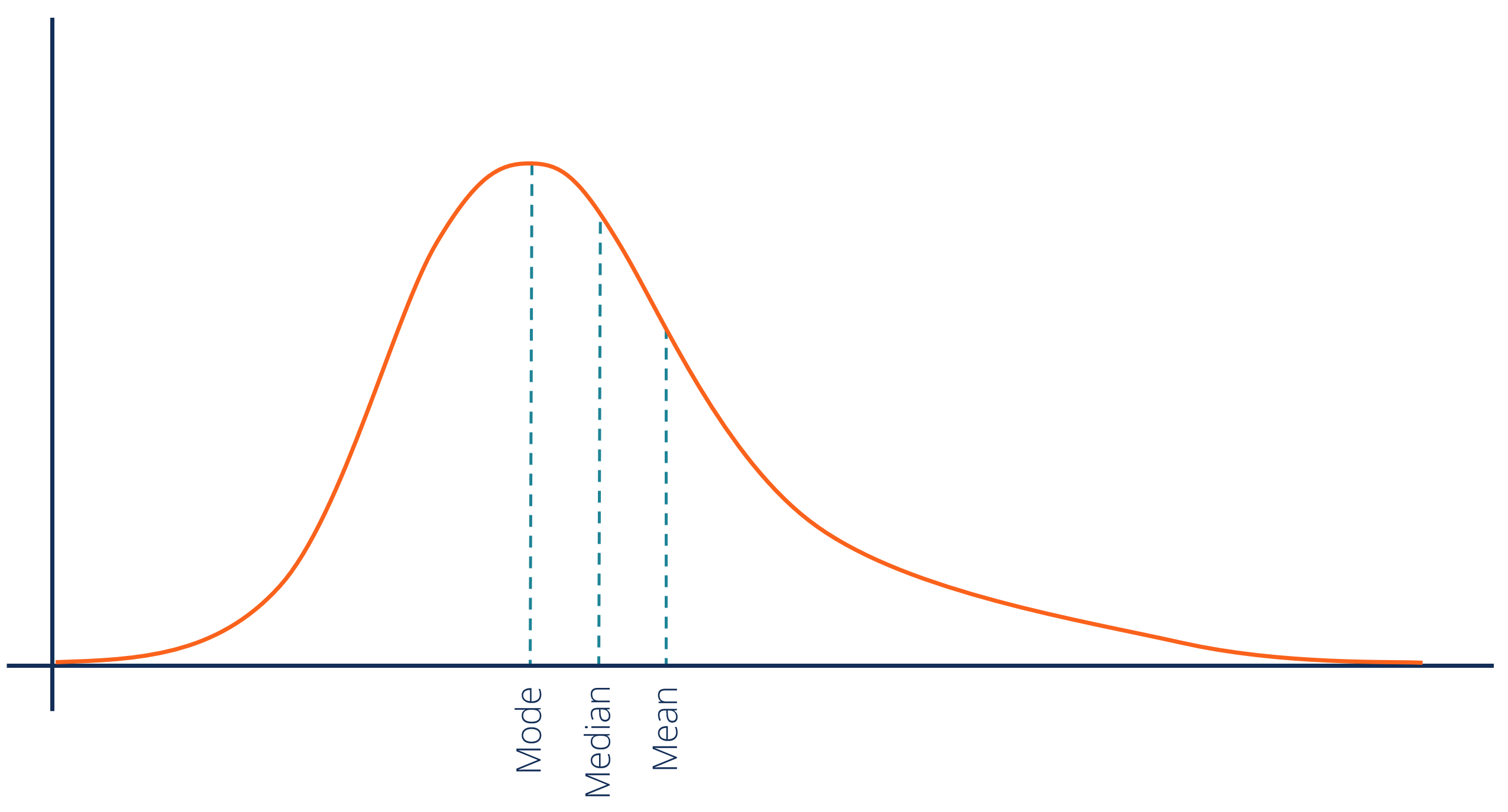
https://corporatefinanceinstitute.com/resources/knowledge/other/positively-skewed-distribution/
A positively skewed or skewed right distribution is when there is a long “tail” to the right side of the distribution, showing far fewer high results than low results. What this means for us is that it is very difficult to get into that tail range, and we should pay attention if a player does so. For example, only 77 of 363 (21%) forwards who played 40+ games in 2019/20 registered a 9.0 iSCF/60 mark or higher. Obviously not all of these players returned huge fantasy value this season, but a quick look through the list shows up names like Carter Verhaeghe, Conor Garland, Roope Hintz, and Kevin Labanc – all players who produced at a pretty high level when given the opportunity in 2020/21. At the very least we should be more willing to accept breakouts in the following season from players who have already shown the ability to get into the upper echelon of these metrics. A similar cutoff occurs for iCF/60 around the 14.0 mark, where 93 of those 363 (27%) of forwards reached that level. In 2021, 18% of forwards registered a 9.0 iSCF/60 or higher, and 22% hit the 14.0 iCF/60 mark.
I haven’t factored in high danger chances for (HDCF) much in trying to project scoring; while I haven’t studied it in detail my experience has been that just about every player with a high iHDCF rate also has a significant iSCF rate, making it much simpler to stick with iSCF as a predictive metric. I ran a three-part series on predicting goal scoring last offseason and correctly identified impending goal scoring regressions for Mika Zibanejad, Alex Killorn, Travis Konecny, and Brayden Schenn (among others). You can stay tuned for future work on which players fit those regression criteria for 2021/22.
I also look at on-ice (as opposed to individual) numbers for CF/60, SCF/60, and xGF/60 when examining players. This serves to give us an idea of how well the team is performing when they are on the ice. The Nicklas Backstroms and Jakub Voraceks of the NHL don’t always put up great individual advanced stats, but consistently put together good on-ice advanced stats which showcases their playmaking ability to a greater degree. I like xGF as a predictive metric much more in an on-ice or team context because I feel the individual player styles are mitigated by the fact that other players are factoring into the overall number. An obvious, at-a-glance measure I like to use is to compare a player’s xGF to their actual goals for number. As previously mentioned, on average the actual GF will be 14% or so higher vs xGF, but a player with a lower GF/60 than xGF/60 is likely experiencing some bad puck luck and should see a rebound in their future. Likewise, any player who had a 4.5 GF/60 rate versus a 3.0 xGF/60 rate is almost certainly getting too lucky with goals scored. This is a slightly more nuanced way to look at on-ice puck luck, which is normally encapsulated by most analysts in on-ice shooting percentage (oiSH%).
On-Ice Shooting Percentage (oiSH%)
oiSH% is exactly what it sounds like: number of goals scored while on the ice divided by number of shots taken while on the ice. I would consider anything below 8% low and likely to positively regress, while anything above 11% I would consider high and likely to negatively regress. Again, the strength of the regression is tied to how far above or below the mean 8-11% range the individual player’s oiSH% is. Consider that a 3% oiSH% means that player should likely have seen three times as many goals scored while they were on the ice than they actually did, while a 15% oiSH% should come down by about 40%. Put another way, negative regression tends to feel somewhat gentler than positive regression (think Mika Zibanejad’s two six-point games in March after floundering for much of the first half of this season). The raw total of goals scored from 3% to 9% and from 15% to 9% is the same (six goals on every 100 shots), but it feels pretty good going from three goals to nine goals while you won’t be dead in the water if your 15% oiSH% player drops back from fifteen goals to nine. These differences matter, especially when it comes to how your leaguemates are valuing certain players and how you can capitalize on impending regression.
PDO (Sum of On-Ice Shooting Percentage and On-Ice Save Percentage)
I don’t use PDO in any context for fantasy. Perhaps there is a correlation between PDO and increased fantasy production that I need to investigate, but at a basic level I don’t care what save percentage Washington’s goalies posted while Alexander Ovechkin was on the ice. I’m interested in whether he personally performed well and if I can expect him to perform the same, better, or worse the following season. Perhaps I’m being too simplistic, but my basic regression analyses have not yielded PDO as a significant stat on its own. Until I have hard evidence that PDO is a better indicator than my other metrics, I’ll continue to work with what I’ve got.
Application
I personally believe that statistical analysis like this is most helpful in identifying three types of players: players who outperformed their natural talent level, players who underperformed their natural talent level, and players who could significantly improve their production if given greater opportunity. Now that you have an understanding of the major metrics that I’m interested in from a fantasy perspective, you can do some hunting on your own. I’m personally pretty interested in a certain underutilized Islander for 2021/22 already; if you made it to this point you should be well-equipped to search on the NST website and figure out who that might be.
That’s all for this one folks! Make sure you follow Apples & Ginos on Twitter or join the Apples & Ginos Discord server for more content and to ask any fantasy hockey questions you may have.
Thanks for reading, you are appreciated!
Nate
Advanced stats credit: Natural Stat Trick
Title photo credit: Getty Images

34 thoughts on “Applying Advanced Stats to Fantasy Hockey”